Responsive Web Design Services for Modern Business Websites
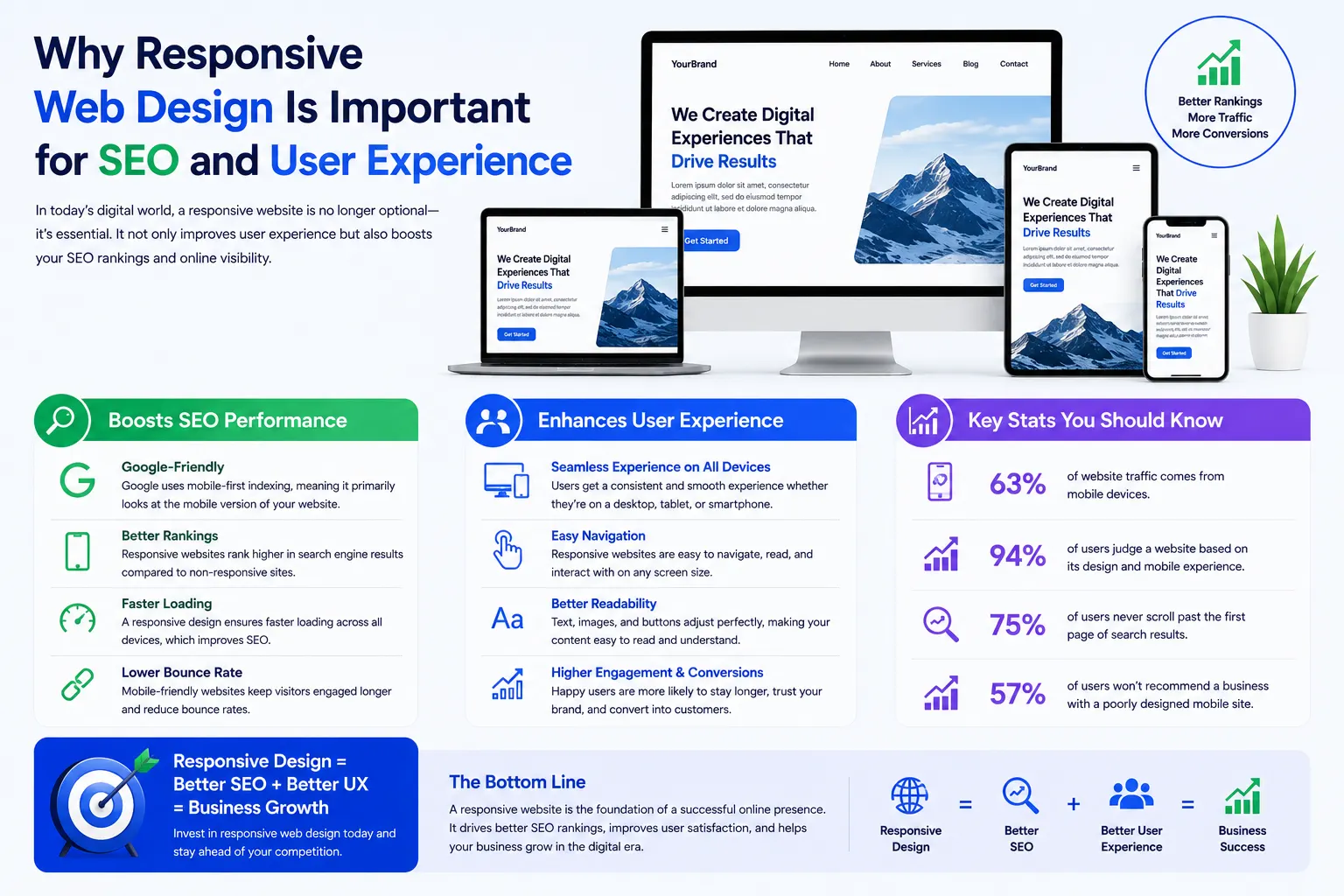
At Mantra Tech Fusion, we create responsive web designs that provide smooth browsing experiences across all devices. Modern users access websites through mobile phones, tablets, laptops, and desktops, so a website must automatically adapt to different screen sizes without breaking layouts or reducing usability.
Our responsive web design services are designed for startups, local businesses, eCommerce brands, agencies, and enterprise companies that want professional websites optimized for all devices. We focus on creating layouts that are visually clean, mobile friendly, easy to navigate, and built for user engagement.
A responsive website is not only important for users but also for search engines. Google prioritizes mobile-friendly websites because they improve browsing experience and accessibility. At Mantra Tech Fusion, we design responsive websites that support SEO, improve performance, and help businesses build stronger digital presence.
What is responsive web design?
Responsive web design is the process of creating websites that automatically adjust and function properly on mobile phones, tablets, laptops, and desktop screens for better user experience.
Why Responsive Web Design Is Important
A large percentage of website traffic now comes from mobile devices. If your website does not work properly on smaller screens, visitors may leave quickly, reducing engagement and business opportunities.
- Improves mobile user experience
- Supports SEO and Google rankings
- Increases customer engagement
- Reduces bounce rates
- Improves website accessibility
- Creates professional brand image
- Supports faster navigation
- Works smoothly on all screen sizes
Our Responsive Web Design Services
At Mantra Tech Fusion, we provide complete responsive website design solutions focused on performance, flexibility, and user experience.
Mobile Friendly Website Design
We create websites optimized specifically for mobile users to ensure smooth navigation, readability, and interaction on smartphones.
- Mobile optimized layouts
- Touch-friendly navigation
- Responsive typography
- Optimized mobile spacing
- Clickable button optimization
- Fast-loading mobile sections
- Easy scrolling experience
- Mobile-first design approach
Cross Device Responsive Design
A responsive website should function properly on every screen size. We test and optimize layouts for multiple devices and resolutions.
- Desktop responsive layouts
- Tablet optimization
- Cross-browser compatibility
- Flexible content sections
- Adaptive image scaling
- Screen-size compatibility
- Responsive grid systems
- Fluid page structures
Responsive UI/UX Design
User experience plays a major role in responsive websites. We design interfaces that remain easy to use and visually balanced across all devices.
- User-friendly responsive interfaces
- Responsive wireframe planning
- Mobile navigation optimization
- Responsive content hierarchy
- Interactive layouts
- Optimized readability
- Engagement-focused design
- Responsive user journey planning
Responsive eCommerce Design
Online stores require responsive layouts to improve shopping experience and mobile conversions. We create eCommerce designs optimized for all devices.
- Responsive product pages
- Mobile shopping optimization
- Responsive checkout design
- Category page optimization
- Touch-friendly product browsing
- Adaptive product grids
- Mobile conversion optimization
- Responsive cart systems
Landing Page Responsive Design
Landing pages must load quickly and maintain clear layouts on all devices to improve conversions and campaign performance.
- Responsive campaign pages
- Lead generation layouts
- CTA optimization
- Fast-loading responsive pages
- Responsive forms
- Mobile-focused landing sections
- Adaptive content blocks
- Responsive marketing layouts
Responsive Web Design for Different Businesses
Responsive Design for Startups
Startups need websites that look modern and work smoothly across all devices to create strong first impressions and support early growth.
Responsive Design for Local Businesses
Local businesses benefit from mobile-friendly websites because nearby customers often search services directly from smartphones.
Responsive Design for eCommerce Brands
Responsive eCommerce websites improve shopping experience, product accessibility, and mobile conversion opportunities.
Responsive Design for Corporate Companies
Corporate businesses require responsive layouts that maintain professional structure and readability across all devices.
Our Responsive Web Design Process
1. Website & Audience Analysis
We study your business, audience behavior, device usage patterns, and website goals before planning the responsive structure.
2. Layout Planning
Our team creates flexible layout structures that automatically adapt to different screen sizes and resolutions.
3. Mobile First Design
We design websites with mobile users in mind first to ensure smooth navigation and usability on smaller devices.
4. Responsive UI Development
Our designers create adaptive interfaces, responsive sections, and scalable layouts optimized for user interaction.
5. Cross Device Testing
We test website responsiveness across desktops, tablets, smartphones, and browsers to ensure consistent performance.
6. Final Optimization
Before launch, we optimize responsiveness, speed, layout stability, and visual consistency for better user experience.
SEO Benefits of Responsive Web Design
Responsive websites are important for search engine optimization because Google prioritizes mobile-friendly and user-focused websites in search results.
- Improves mobile SEO performance
- Supports Google mobile-first indexing
- Reduces bounce rates
- Improves page usability
- Enhances user engagement
- Supports Core Web Vitals optimization
- Creates better navigation structure
- Improves website accessibility
Why Choose Mantra Tech Fusion?
At Mantra Tech Fusion, we focus on creating responsive websites that combine modern design, smooth usability, and business-focused strategy. Our goal is to help businesses provide better digital experiences across all devices.
- Mobile-first responsive design approach
- Modern and clean layouts
- Cross-device compatibility
- SEO-friendly responsive structure
- User-focused UI/UX design
- Fast-loading responsive pages
- Affordable and scalable solutions
- Long-term design support
Industries We Serve
- Healthcare
- Education
- Finance
- eCommerce
- Real Estate
- Technology Companies
- Travel & Hospitality
- Construction Businesses
- Professional Services
- Local Businesses
- Corporate Companies
- Startup Brands
Build a Mobile Friendly Website for Modern Users
A responsive website improves how users interact with your business online. It creates better browsing experiences, supports SEO performance, and helps businesses stay competitive in the modern digital market.
At Mantra Tech Fusion, we create responsive web designs that combine flexibility, speed, usability, and modern visual experience to support long-term online growth.
Let’s Create Your Responsive Website
If you are looking for professional responsive web design services in India or worldwide, partner with Mantra Tech Fusion. Our team is ready to create a modern, responsive, and business-focused website optimized for every device.