
Responsive web design represents the practice of building web pages that adapt smoothly to any screen size, from compact mobile smartphones to wide desktop monitors. With the overwhelming majority of commercial web browsing taking place on mobile devices, responsive architecture is no longer optional. It forms the baseline requirement for both organic search ranking and online customer conversion.
The Mechanics of Mobile-First Indexing
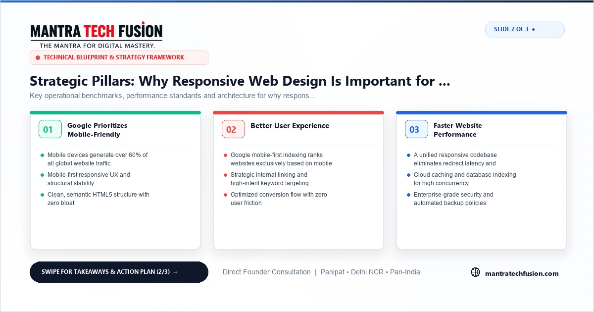
Major search engines exclusively use mobile-first indexing to crawl and evaluate web pages. This means search bots view, render, and rank your website using a mobile browser viewport simulator. If your mobile layout hides important text, breaks navigation menus, or distorts tables, your search engine rankings will suffer across all devices, including desktop searches.
A properly configured responsive layout uses a single URL and a single codebase to serve identical content to all visitors. This avoids the technical complications of maintaining separate mobile subdomains, eliminating duplicate content warnings and fragmented link equity.
Key Technical Elements of Responsive Engineering
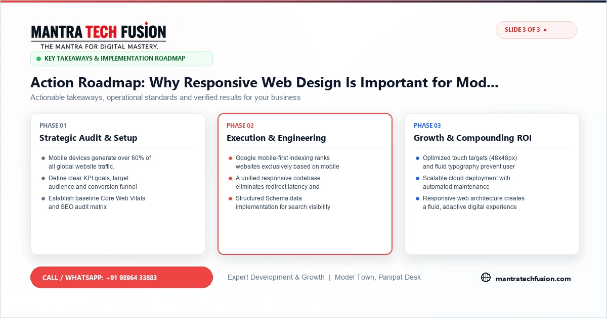
Developing a truly responsive business website involves careful technical considerations rather than simply shrinking desktop layouts:
- Fluid Grid and Flexbox Layouts: Instead of fixed pixel widths, modern stylesheets utilize relative percentage units, CSS Grid, and Flexbox modules. This allows page elements to adjust proportionally as the screen dimensions shift.
- Proper Viewport Meta Configuration: Declaring an explicit viewport meta tag instructs mobile browsers to render the page at the device's native scale, preventing unexpected horizontal scrolling.
- Readable Typography Hierarchy: Text sizes must remain legible without user zooming. Headings and body copy should maintain comfortable line lengths and contrast ratios across all screen resolutions.
- Appropriate Touch Target Spacing: Interactive elements, including navigation links, buttons, and form inputs, must provide adequate physical spacing to prevent accidental taps on touchscreens.
Impact on User Experience and Commercial Inquiries
Beyond search ranking benefits, responsive design directly dictates how prospective buyers interact with your enterprise. When an industrial buyer or retail consumer visits an unresponsive website on a mobile phone, they face unreadable text, broken tables, and frustrating navigation bars.
In contrast, an accessible, mobile-optimized interface allows visitors to browse product specifications, locate contact details, and submit quote requests with ease. Fast mobile page rendering reduces user abandonment, ensuring that paid marketing traffic and organic search visitors convert into tangible inquiries.
Avoiding Common Mobile Responsive Mistakes
Many websites experience poor mobile engagement due to easily avoidable implementation flaws:
- Excessive JavaScript Overhead: Heavy third-party animation libraries and bloated page builder plugins consume mobile processor cycles, causing sluggish scrolling.
- Unoptimized High-Resolution Imagery: Uploading large desktop image files without responsive picture elements or modern formats wastes mobile bandwidth and slows loading times.
- Fixed Width Data Tables: Wide technical specification tables that lack horizontal scrolling wrappers can force the entire mobile screen into horizontal overflow.
- Intrusive Popups: Full-screen promotional overlays that cover the screen and lack clear dismissal buttons frustrate mobile users and can trigger search engine penalties.
This article in three pictures
Building for Long-Term Device Compatibility
The variety of mobile devices, tablet displays, and desktop monitors continues to expand each year. Building lightweight responsive websites using native CSS standards ensures that your web assets remain compatible with emerging hardware form factors without requiring costly redesigns.