Professional Mobile Friendly Website Design Services for Modern Businesses
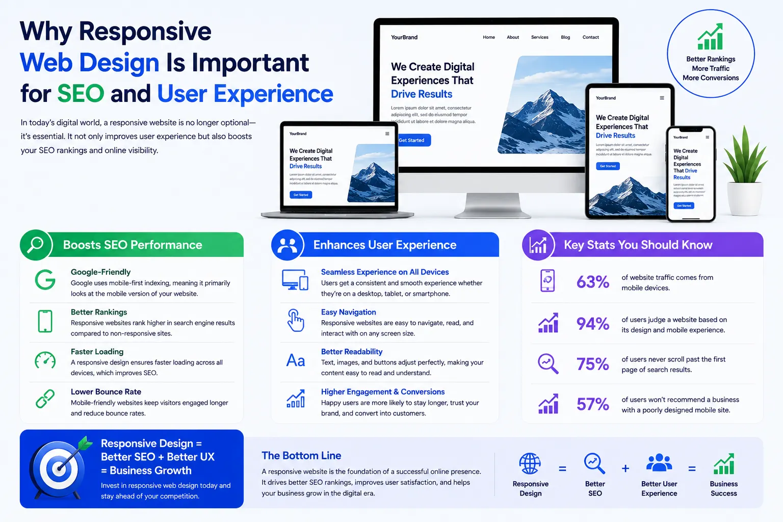
At Mantra Tech Fusion, we create mobile friendly website designs that help businesses provide smooth and responsive browsing experiences across all devices. Today, most users access websites through smartphones and tablets, which makes mobile optimization one of the most important parts of modern website design.
Our mobile friendly website design services are focused on creating responsive, user-friendly, fast-loading, and SEO-friendly websites for startups, local businesses, agencies, eCommerce brands, and enterprise companies. We design websites that automatically adjust according to different screen sizes without affecting usability or visual quality.
A professionally designed mobile friendly website improves customer engagement, reduces bounce rates, and helps businesses create better first impressions online. At Mantra Tech Fusion, we combine modern responsiveness, usability, and performance optimization to build websites designed for long-term digital growth.
What is mobile friendly website design?
Mobile friendly website design is the process of creating websites that automatically adjust and function properly on mobile phones and tablets for better user experience and SEO performance.
Why Mobile Friendly Website Design Is Important
Mobile users expect websites to load quickly, display properly, and function smoothly on smaller screens. A website that is not mobile friendly can reduce customer trust and negatively affect SEO performance.
- Improves mobile user experience
- Supports Google mobile-first indexing
- Reduces bounce rates
- Improves customer engagement
- Supports SEO performance
- Creates professional brand image
- Improves accessibility on all devices
- Supports business growth opportunities
Our Mobile Friendly Website Design Services
At Mantra Tech Fusion, we provide complete mobile responsive website design solutions tailored according to your business goals and audience behavior.
Responsive Website Design
We create responsive websites that automatically adapt to mobile phones, tablets, laptops, and desktop devices for smooth browsing experiences.
- Responsive layout structure
- Cross-device compatibility
- Flexible content sections
- Responsive navigation systems
- Adaptive image optimization
- Responsive typography planning
- Touch-friendly interface design
- Mobile-first website structure
Mobile Optimized Business Website Design
Business websites should function properly on mobile devices to improve customer accessibility and engagement.
- Mobile-friendly business layouts
- Responsive service pages
- Lead generation optimization
- Business enquiry sections
- Fast mobile browsing experience
- Responsive branding integration
- Interactive mobile sections
- Professional mobile structure
Mobile Friendly eCommerce Website Design
Online stores require mobile optimized shopping experiences because most customers browse and shop directly from smartphones.
- Responsive product grids
- Mobile shopping optimization
- Responsive checkout pages
- Touch-friendly navigation
- Adaptive product layouts
- Fast-loading store pages
- Responsive shopping experience
- Conversion-focused mobile design
Mobile UI/UX Design
User experience is important for keeping mobile visitors engaged and helping them navigate smoothly through your website.
- User-friendly mobile interfaces
- Simple navigation planning
- Interactive responsive layouts
- Improved readability structure
- Visual hierarchy optimization
- Touch-focused user experience
- Mobile engagement optimization
- Responsive user flow design
SEO Friendly Mobile Website Design
Mobile friendly websites help improve search engine visibility and support better online performance.
- Responsive SEO support
- Fast-loading website layouts
- Optimized heading structure
- Clean URL planning
- Core Web Vitals optimization
- Mobile-first SEO structure
- Search-friendly navigation flow
- Schema-ready structure
Mobile Website Redesign Services
If your current website is not mobile responsive or feels outdated, we redesign it with modern layouts, responsive structures, and improved usability.
- Responsive redesign optimization
- Modern mobile layouts
- UI/UX improvements
- Performance-focused redesign
- Navigation upgrades
- Visual branding enhancement
- SEO-friendly restructuring
- Mobile browsing optimization
Mobile Friendly Website Design for Different Businesses
Mobile Friendly Websites for Startups
Startups require responsive websites that create strong first impressions and support customer engagement on all devices.
Mobile Friendly Websites for Local Businesses
Local businesses benefit from mobile optimized websites because nearby customers often search services directly from smartphones.
Mobile Friendly Websites for eCommerce Brands
eCommerce brands require responsive shopping experiences that improve product accessibility and mobile conversions.
Mobile Friendly Websites for Enterprise Companies
Enterprise businesses require scalable and responsive websites that support professional communication and digital growth.
Our Mobile Friendly Website Design Process
1. Business & User Research
We study your audience behavior, device usage, competitors, and business goals before planning the website structure.
2. Responsive Layout Planning
Our team creates flexible layouts and navigation systems optimized for all screen sizes and devices.
3. UI/UX Design Creation
We create visually engaging and mobile-friendly interfaces focused on usability and customer interaction.
4. Mobile Responsive Optimization
Every website is optimized for smartphones, tablets, laptops, and desktop devices.
5. SEO & Performance Optimization
We ensure the website supports SEO best practices, fast loading, and smooth browsing performance.
6. Final Testing & Launch Support
Before launch, we test responsiveness, usability, speed, and overall browsing experience carefully.
Benefits of Mobile Friendly Website Design
A mobile friendly website improves user engagement, SEO visibility, and customer trust while supporting long-term digital growth opportunities.
- Better mobile browsing experience
- Improved customer engagement
- Reduced bounce rates
- SEO-friendly structure
- Improved mobile accessibility
- Faster loading performance
- Professional digital presentation
- Long-term business scalability
Why Choose Mantra Tech Fusion?
At Mantra Tech Fusion, we combine responsiveness, modern design trends, usability, and business-focused strategy to create mobile friendly websites built for long-term online success.
- Modern mobile friendly website designs
- Responsive and SEO-friendly layouts
- User-focused UI/UX planning
- Mobile-first design strategy
- Professional branding integration
- Affordable and scalable solutions
- Transparent communication process
- Long-term website support
Industries We Serve
- Healthcare
- Education
- Finance
- eCommerce
- Real Estate
- Technology Companies
- Travel & Hospitality
- Construction Businesses
- Professional Services
- Local Businesses
- Corporate Companies
- Startup Brands
Create a Mobile Friendly Website for Modern Users
A professionally designed mobile friendly website helps businesses improve customer experiences, increase accessibility, and support stronger online engagement. Better responsiveness directly contributes to improved digital performance.
At Mantra Tech Fusion, we create mobile friendly website designs that combine responsiveness, usability, SEO-friendly structure, and modern visuals to help businesses grow online successfully.
Let’s Design Your Mobile Friendly Website
If you are looking for professional mobile friendly website design services in India or worldwide, partner with Mantra Tech Fusion. Our team is ready to create responsive, modern, and business-focused websites tailored to your goals.